Task 1 · Dynamic Mixed Chart
You should spend about 20 minutes on this task. Write at least 150 words.
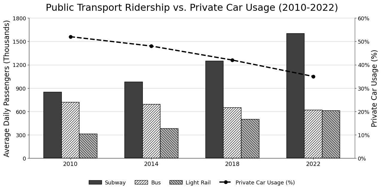
The bar chart and line graph below illustrate the average number of daily passengers, in thousands, using three major public transport systems and the percentage of daily journeys made by private car in a metropolitan city from 2010 to 2022.
Summarise the information by selecting and reporting the main features, and make comparisons where relevant.
Want to see your estimated band score?
Check your writing scorePart 1 · Band 9 Sample Answer
The combined chart compares average daily ridership on the subway, buses and light rail in a metropolitan city at four-year intervals between 2010 and 2022, alongside the proportion of daily trips made by private car.
Overall, subway and light-rail patronage rose substantially, contributing to an increase in public transport use, while the share of journeys undertaken by car declined consistently. The subway was the most heavily used system throughout and experienced the largest absolute growth. Bus ridership, in contrast, fell gradually, and by 2022 it was only marginally higher than the light-rail figure.
In 2010, the subway carried approximately 850,000 passengers per day, ahead of buses at around 720,000. Light rail was considerably less popular, serving only about 320,000 daily users. Subway ridership then climbed to just under one million in 2014 and 1.25 million in 2018, before rising more sharply to 1.6 million by 2022. This represented an overall gain of roughly 750,000 passengers.
Light rail followed a similarly upward trajectory, though from a much lower base. Its daily total increased from 320,000 to about 380,000 in 2014, then reached 500,000 in 2018 and approximately 610,000 in the final year. Meanwhile, bus use slipped from around 720,000 to 690,000 and then 650,000, finishing at roughly 620,000. Consequently, the initial 400,000-passenger gap between buses and light rail had virtually disappeared by 2022. Private car usage moved in the opposite direction to overall public ridership, falling steadily from 52% of daily journeys in 2010 to 48%, 42% and finally 35%.
Part 1 · Band 8 Sample Answer
The bar and line chart presents average daily passenger numbers for three forms of public transport in a city from 2010 to 2022. It also shows the percentage of journeys made by private car in the same four years.
Overall, the subway remained the most popular public transport system and recorded strong growth. Light-rail usage also rose, whereas the number of bus passengers declined slightly. At the same time, private cars accounted for a steadily decreasing share of daily travel.
Approximately 850,000 passengers used the subway each day in 2010, compared with around 720,000 bus users and 320,000 light-rail passengers. Subway ridership increased to just under one million in 2014 before reaching about 1.25 million in 2018. Growth continued during the final four years, and the figure rose to approximately 1.6 million in 2022, nearly twice its initial level.
Daily light-rail use grew more steadily, from about 320,000 in 2010 to 380,000 four years later. It then reached 500,000 in 2018 and around 610,000 by 2022. Bus ridership followed the opposite pattern, falling gradually from roughly 720,000 to 690,000, 650,000 and finally 620,000. As a result, light rail had almost caught up with buses at the end of the period, despite a large difference between them in 2010. Private car use also declined in every interval. Its share of journeys fell from approximately 52% in 2010 to 48% in 2014 and 42% in 2018, before reaching 35% in 2022, an overall decrease of 17 percentage points.
Part 1 · Band 7 Sample Answer
The chart shows the average number of passengers using the subway, buses and light rail each day in a metropolitan city between 2010 and 2022. Passenger totals are given in thousands, while the line indicates the percentage of daily journeys made by private car.
Overall, the subway was the most widely used public transport system in all four years, and its passenger numbers increased considerably. Light-rail usage also grew, but bus use declined slowly. In addition, the proportion of journeys made by car fell throughout the period.
In 2010, around 850,000 people used the subway daily. This figure rose to approximately 980,000 in 2014 and then to 1.25 million in 2018. By 2022, subway ridership had reached about 1.6 million, which was nearly double the 2010 level.
Bus passenger numbers showed a different trend. They decreased from roughly 720,000 per day in 2010 to 690,000 in 2014 and 650,000 in 2018. The final figure was around 620,000. By comparison, light-rail use rose from approximately 320,000 to 380,000 during the first four years, before increasing to 500,000 in 2018 and about 610,000 in 2022. Therefore, light rail had almost the same number of passengers as buses by the end. Meanwhile, private car usage fell steadily from around 52% of journeys in 2010 to 48% in 2014. It declined further to 42% in 2018 and reached 35% in 2022, a total reduction of approximately 17 percentage points.