Task 1 · Dynamic Multiple-Line Graph
You should spend about 20 minutes on this task. Write at least 150 words.
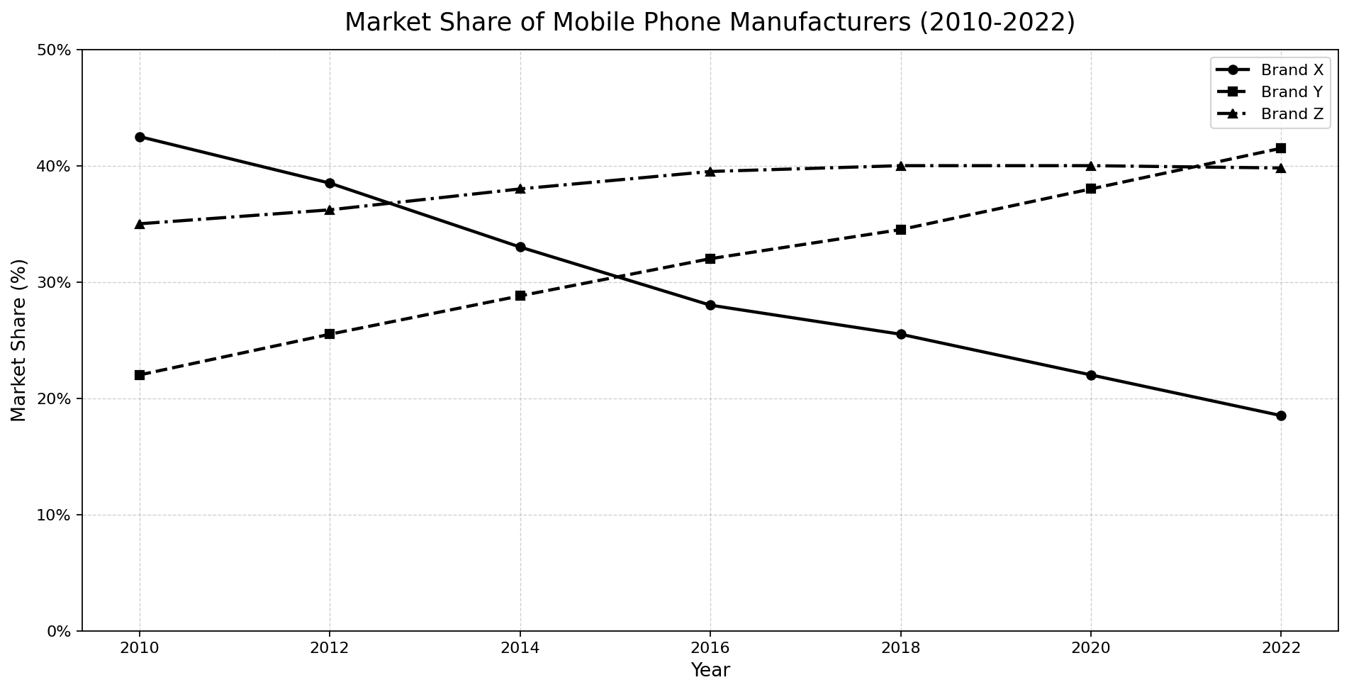
The line graph below shows the market share of three major mobile phone manufacturers (Brand X, Brand Y, and Brand Z) in a region from 2010 to 2022.
Summarise the information by selecting and reporting the main features, and make comparisons where relevant.
Want to see your estimated band score?
Check your writing scorePart 1 · Band 9 Sample Answer
The line graph compares the percentage of the regional mobile phone market held by Brands X, Y and Z at two-year intervals between 2010 and 2022.
Overall, Brand X experienced a sustained and substantial loss of market share, whereas Brand Y followed the opposite trajectory and ultimately became the market leader. Brand Z rose more moderately before levelling off at approximately 40%. By the end of the period, the once-dominant Brand X had fallen to a distant third place.
In 2010, Brand X accounted for roughly 42.5% of the market, almost twice Brand Y’s figure of 22%. Brand Z occupied an intermediate position at 35%. Over the next four years, X’s share declined steadily to 33%, while those of Y and Z climbed to 29% and 38% respectively. Consequently, Brand Z overtook Brand X sometime between 2012 and 2014.
From 2014 onwards, the divergence between X and Y became more pronounced. Brand X’s proportion dropped by five percentage points to 28% in 2016 and continued falling to about 18.5% in 2022. In contrast, Brand Y advanced consistently, reaching 32% in 2016 and 38% in 2020. It then surpassed Brand Z to finish at approximately 41.5%. Brand Z increased slightly to around 39.5% in 2016, remained at 40% from 2018 to 2020, and ended the period at virtually the same level.
Part 1 · Band 8 Sample Answer
The graph illustrates changes in the market shares of three leading mobile phone producers in a particular region from 2010 to 2022.
Overall, Brand X’s share fell throughout the period, while Brand Y’s increased continuously. Brand Z recorded a smaller rise and then remained broadly stable. Although Brand X was the clear leader in 2010, Brand Y had the largest proportion by 2022.
At the beginning, Brand X controlled about 42.5% of the market, compared with 35% for Brand Z and only 22% for Brand Y. By 2012, X had declined to approximately 38.5%, whereas Y and Z had risen to around 25.5% and 36% respectively. Two years later, Brand Z became the leading manufacturer with 38%, as Brand X dropped to 33%. Brand Y also grew, reaching 29%.
After 2014, Brand X continued to lose ground, falling to 28% in 2016 and about 25.5% in 2018. Its share then decreased further to 22% in 2020 and roughly 18.5% in the final year. Meanwhile, Brand Y rose steadily from 32% in 2016 to 38% in 2020, before reaching approximately 41.5% in 2022 and moving ahead of Brand Z. The latter increased to nearly 40% in 2016 and remained close to this figure for the rest of the period.
Part 1 · Band 7 Sample Answer
The line graph shows the market share percentages of Brands X, Y and Z in one region between 2010 and 2022.
Overall, Brand X showed a clear downward trend, while Brand Y increased steadily. Brand Z rose gradually during the first half of the period and then stayed almost unchanged. By 2022, Brand Y had become the largest manufacturer by market share, and Brand X had become the smallest.
In 2010, Brand X had the highest share, at about 42.5%. Brand Z was second with 35%, while Brand Y had just 22%. Brand X’s figure then fell to around 38.5% in 2012 and 33% in 2014. In comparison, Brand Z increased to 36% and then 38% in these years, overtaking Brand X by 2014. Brand Y also grew to approximately 25.5% in 2012 and 29% two years later.
The same general trends continued after 2014. Brand X declined to 28% in 2016, about 25.5% in 2018 and only 18.5% in 2022. By contrast, Brand Y climbed to 32% in 2016 and around 34.5% in 2018. It reached 38% in 2020 before finishing at roughly 41.5%, slightly above Brand Z. Brand Z remained close to 40% from 2016 onwards and ended at about 40%.