Task 1 · Dynamic Multiple-Line Graph
You should spend about 20 minutes on this task. Write at least 150 words.
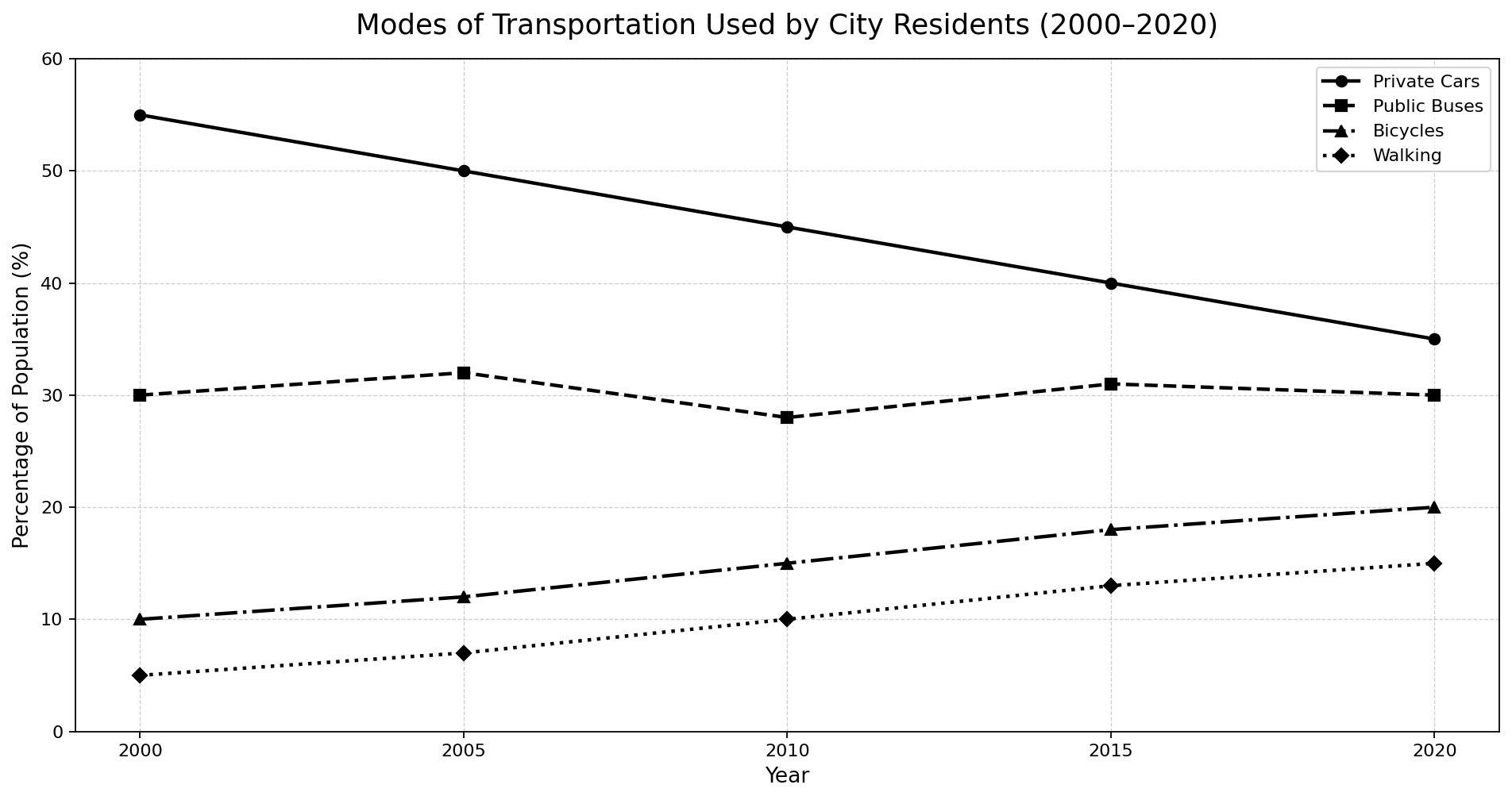
The line graph below shows the percentage of the population using different forms of transportation in a city between 2000 and 2020.
Summarise the information by selecting and reporting the main features, and make comparisons where relevant.
Want to see your estimated band score?
Check your writing scorePart 1 · Band 9 Sample Answer
The line graph compares the proportions of residents in a city who used private cars, public buses, bicycles and walking at five-year intervals from 2000 to 2020.
Overall, private cars remained the most widely used form of transport throughout the period, despite a substantial and uninterrupted decline. Bus use fluctuated within a narrow range and ended at its initial level, whereas both cycling and walking became steadily more prevalent. Consequently, the differences between car use and the other modes, particularly buses, narrowed considerably.
In 2000, 55% of the population used private cars, 25 percentage points more than the figure for public buses. Car use then fell by exactly five points during each five-year interval, reaching 50% in 2005, 45% in 2010 and 40% in 2015 before finishing at 35%. By contrast, bus use edged up from 30% to a peak of 32% in 2005. It subsequently dropped to its low of 28% in 2010, recovered to 31% five years later and returned to 30% in 2020. The gap between these two motorised modes therefore contracted from 25 points to only five.
The two active forms of travel followed parallel upward trajectories. Bicycle use doubled from 10% in 2000 to 20% in 2020, rising successively to 12%, 15% and 18% in the intervening years. Walking also gained ten percentage points overall, tripling from 5% to 15%, with intermediate figures of 7%, 10% and 13%. Although walking remained the least common option in every year, it stayed consistently five points below cycling.
Part 1 · Band 8 Sample Answer
The graph illustrates the percentages of people in a city using four modes of transportation between 2000 and 2020, with figures given every five years.
Overall, private cars were used by the largest proportion of residents in every year, but their popularity declined steadily. Public bus use changed only slightly and showed no overall growth, while the percentages for cycling and walking rose continuously. By 2020, the four figures were therefore much closer together than they had been in 2000.
At the start of the period, private cars were used by 55% of the population, compared with 30% for buses. The car figure then decreased regularly to 50% in 2005 and 45% in 2010. It continued falling to 40% in 2015 and reached 35% by 2020, representing an overall reduction of 20 percentage points.
Bus use followed a less consistent pattern. It increased slightly from 30% to 32% in 2005, before falling to 28% in 2010. The percentage then recovered to 31% in 2015 and ended at 30%, the same as its starting point. As a result, the difference between cars and buses fell sharply from 25 points to five.
Cycling rose from 10% in 2000 to 12% in 2005, 15% in 2010 and 18% in 2015, finally reaching 20%. Walking remained less common but experienced similar growth, increasing from 5% to 7%, 10%, 13% and 15%. Both modes consequently gained ten percentage points, with bicycles consistently five points ahead of walking.
Part 1 · Band 7 Sample Answer
The line graph shows the percentages of city residents who used private cars, public buses, bicycles and walking between 2000 and 2020.
Overall, private cars were the most common form of transport during the whole period, although their use fell steadily. Bus use changed several times but finished at the same level at which it began. In comparison, cycling and walking both became more popular, while walking remained the least widely used mode.
In 2000, 55% of residents used private cars. This figure fell to 50% in 2005 and 45% in 2010. The decline continued over the following decade, with car use reaching 40% in 2015 and 35% in 2020. Public bus use started at 30% and rose slightly to 32% in 2005. It then dropped to 28% in 2010, before recovering to 31% and finally returning to 30%.
The percentage using bicycles increased at every point shown. It rose from 10% in 2000 to 12% in 2005, and then reached 15% in 2010. Further growth took the figure to 18% in 2015 and 20% at the end of the period. Walking followed the same general pattern, rising from 5% to 7%, 10%, 13% and 15% respectively.
Therefore, car use declined by 20 percentage points overall, while both cycling and walking increased by ten points. The difference between private cars and buses also became much smaller, falling from 25 points in 2000 to only five in 2020.